
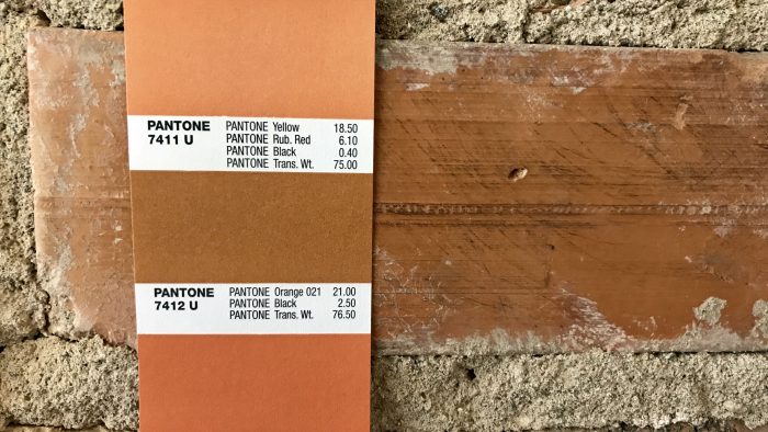
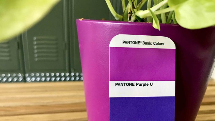
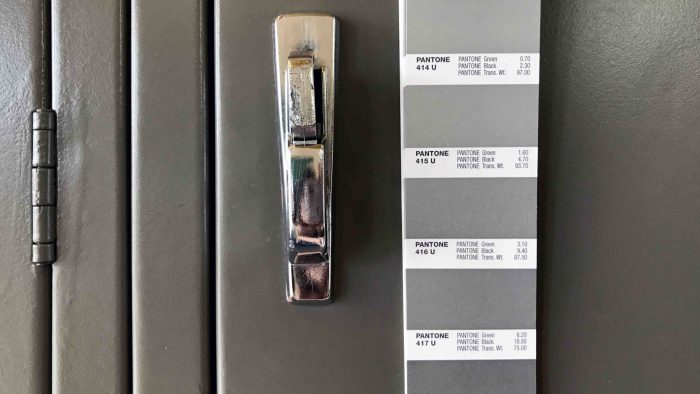
When in doubt, reach for the color chips.
I’m currently working on a company’s rebrand. Picking their new brand colors has been a process. When we started to feel overwhelmed, we knew there was a standard to lean on. Pantone. Then I started looking around the office and was dying to find matching Pantones for everything. So here you go. Fun facts about Pantone and a little exploration of color.
Pantone started as a printing company, specializing in color charts for cosmetics, fashion, and the medical industry.
Pantone transitioned into the color-matching, graphic standards system, and global design force that it is today when Lawrence Herbert bought the company in 1962.
Herbert noticed how difficult it was for designers, ad agencies, and printers to communicate/identify colors.
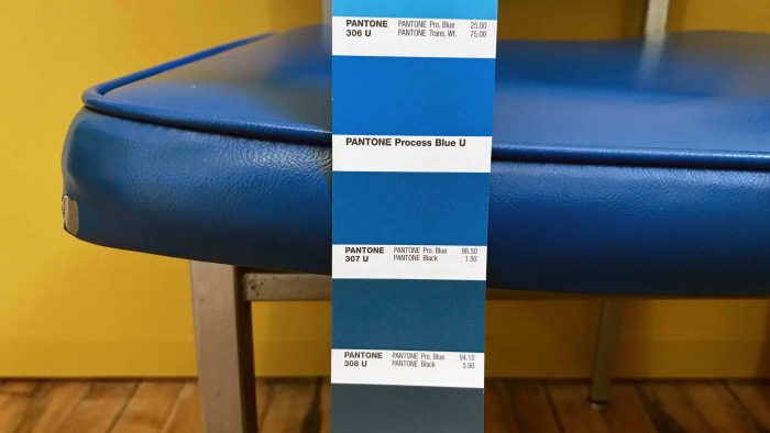
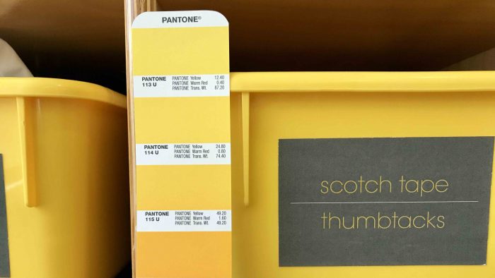
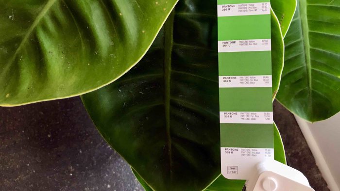
Pantone doesn’t sell physical ink. It specifies how to mix the right proportions of CMYK to produce the color.
Pantone is the most widely used color-matching system in every country (except Japan).
The Pantone “color of the year” started in 2000. The color is selected by gauging culture at the time. Laurie Pressman, the vice president of the Pantone Color Institute, said, “For us, it was coming up with a way to communicate what’s taking place in our language. It’s our way of chiming in. We speak a language of color. So we see things in color. We can explain things in color.”
Source: Co. Design, How Pantone Became the Definitive Language of Color, www.fastcodesign.com