The Firecracker Foundation provides holistic healing services to children who have survived sexual trauma. They offer individual mental health therapy, trauma sensitive yoga therapy and caretaker support groups at no cost to protect and support child survivors and their families in our community.
For the past three years, Redhead has designed the foundation’s annual report. This year, I had the honor of being the designer on the job. What I love about this piece is that not only does it serve as a promotional tool, but it’s a conversation starter. It creates awareness of the services they provide and the survivors they have helped. Tashmica Torok, Firecracker’s founder and executive director, has done an amazing job fighting for the rights of survivors in the community.
Tashmica knew we were invested in this piece as much as she is for her foundation, so she trusted us. She supplied most of the content, but left the design up to us, to me.
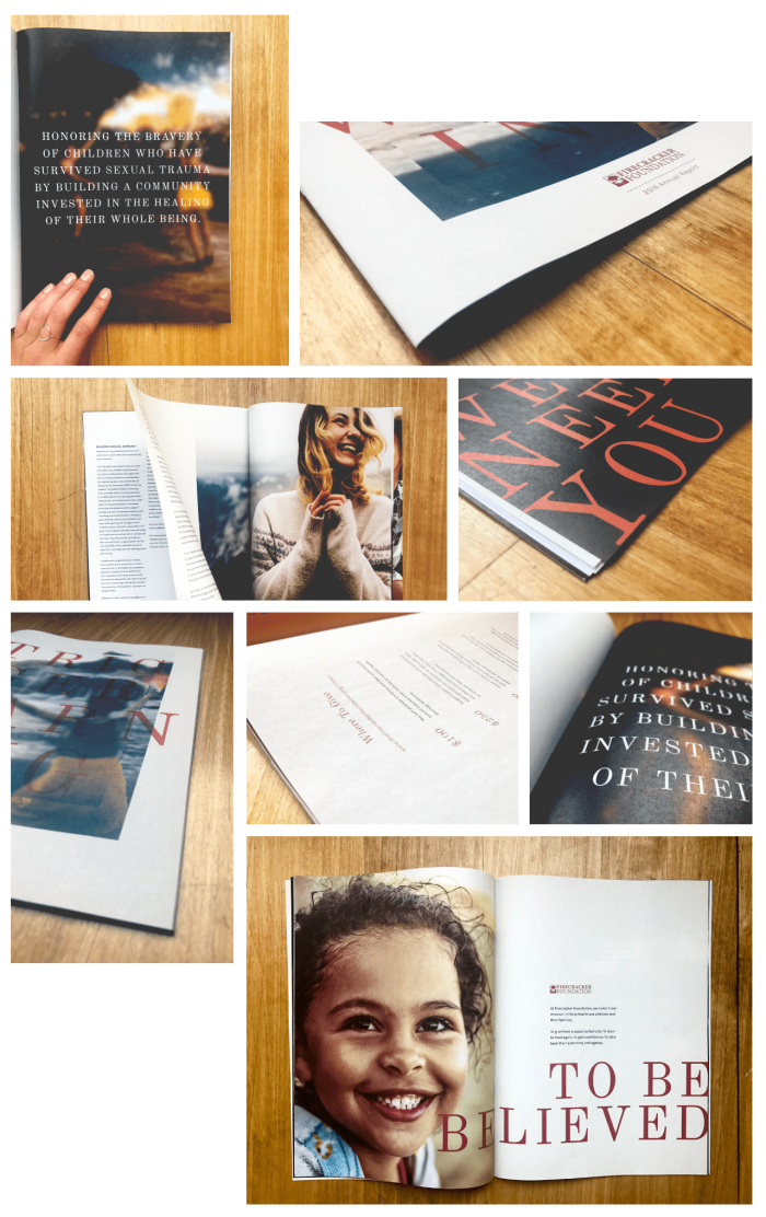
Beyond its content and message, one of my favorite things about this piece is the paper we printed it on. It’s on thin, 20-pound, uncoated paper, and it’s lovely. It might be the thinnest paper we have ever printed on. I wanted to create a magazine feel for this annual report, putting the cutesiness aside (an approach we have taken in the past) and sophisticate it up. Especially because the foundation is “growing up”; Firecracker marked its fourth anniversary July 31.
With many of our clients, we often use stock photography because of lack of resources, budget and/or availability. But these days, I’m beginning to think it’s becoming more cost-effective to set up a photo shoot to capture your vision than pay the ever-increasing price for credits on a site and pray to the stock photo gods that you can find what you need.
Fortunately—and for the first time—I was able to capture my vision for the Firecracker Foundation’s annual report with stock photography. By “the first time,” I mean for the first time with ease. Still had to pay a pretty penny to purchase the 14 photos, but it was worth it. I can’t tell you the hours I’ve spent with some projects scrolling through stock sites trying to find photos that aren’t cheeseball. I’m sure you creatives out there can relate. It’s a love/hate relationship. More often more hate than love.
The moral of this design story? Try something new. Maybe numbers need to be crunched to see if a photo shoot is more cost effective and worth your time. Maybe stock photos can surprise you. Try a new format or paper type every once in a while. And it’s OK to trust the designers who are paid to make you look good.
While some of the content in the Firecracker Foundation’s annual report discusses experiences that are upsetting to fathom, I hope those who read it are inspired. Inspired to learn more about the people in their community who are hurting. Inspired to donate their time and/or money to a great cause. Whatever it may be, my goal was for the design to inspire people to give compassion to those around them. You never know who is a survivor of sexual trauma.