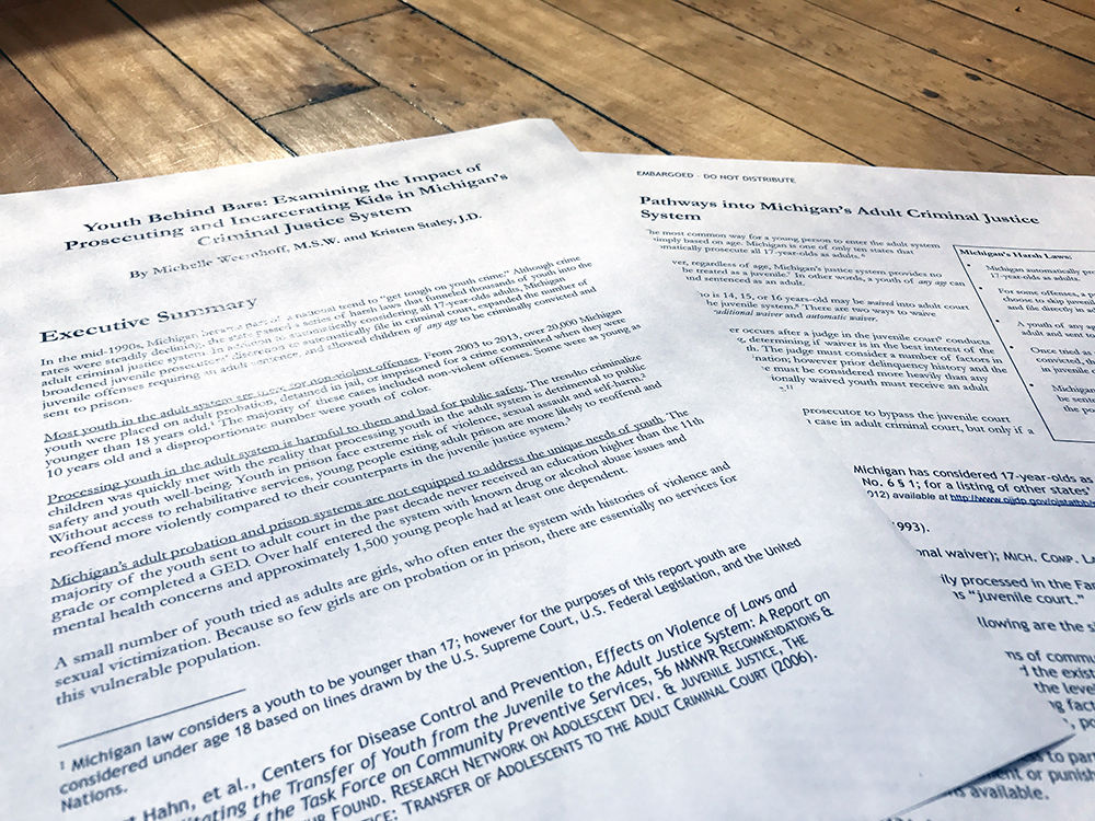
Yep, I said reports. But trust me, they can be lovely.
One of the undercover things we do is fancify reports. While it’s not the core of our business, it’s still hugely satisfying when we get to sink our teeth into a good report. Because, No. 1, we’re fairly nerdy by nature, and we like to read and learn new things. Designing a detailed report lets us understand our world better, know who is fighting the good fight and understand cultural nuances.
(The best is when a client comes into our office wanting help, clutching an example of a report they love and want to emulate … then, lo and behold, it’s ours. Happens regularly. True story.)
There are significant advantages for our clients who go the extra mile, too. Anyone who knows us knows we don’t just make it pretty, we make it smart. We almost always apply conceptual thinking and a metaphorical layer to a design, because that is what makes it stand out and evoke a reaction in the reader.
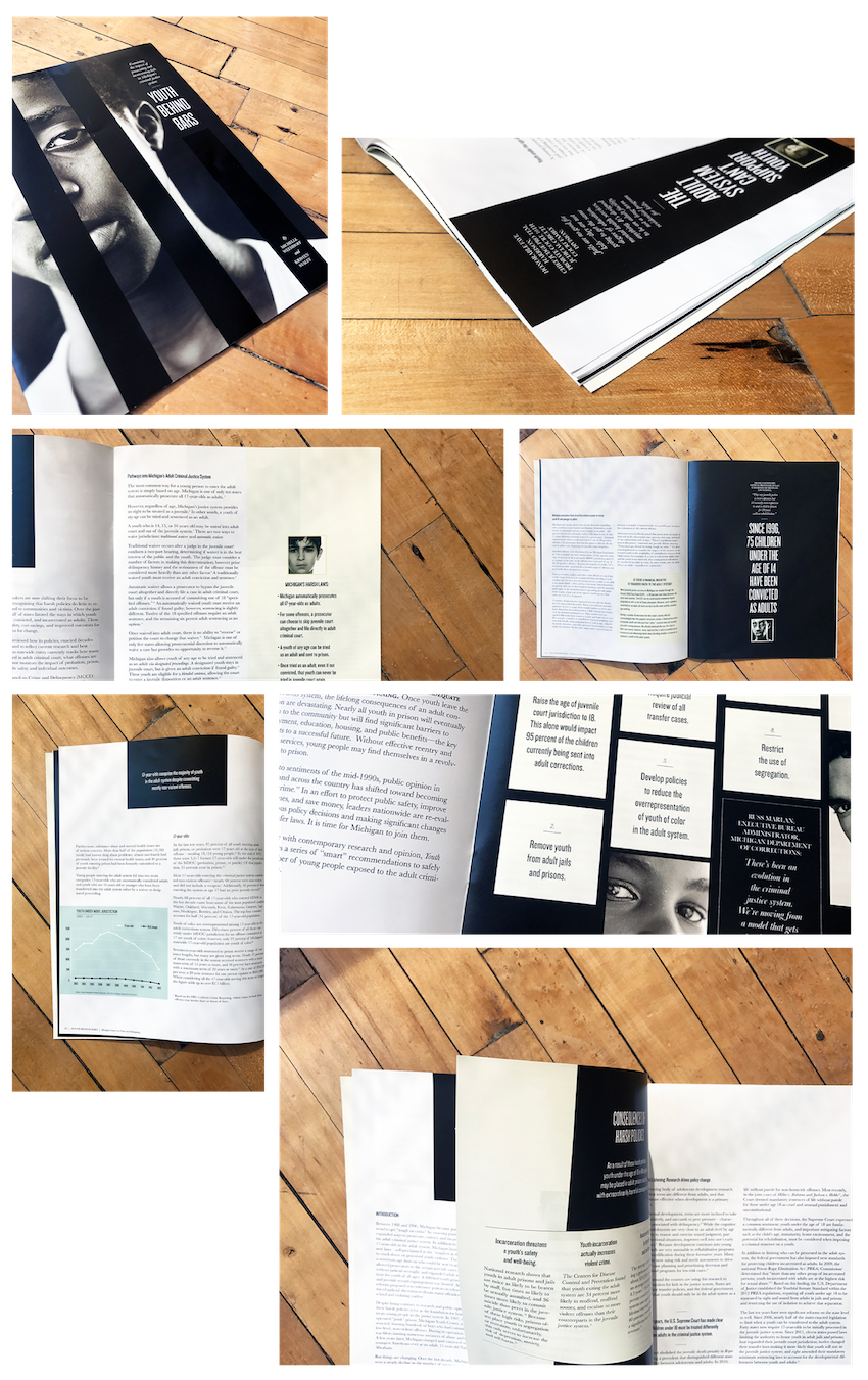
One of my favorites is a report called “Youth Behind Bars” that we did for the Michigan Council on Crime and Delinquency a few years ago.
Before working on this report, I did not know Michigan automatically prosecutes all 17-year-olds as adults, or that Michigan allows youth as young as 14 to be sentenced to life in prison. I also did not understand the level of mental distress as well as physical harm that comes to children who enter the adult prison system.
I am admittedly simplifying a whole bunch of stuff for the sake of brevity here. But if you want to read the report, authored by Michelle Weemhoff and Kristen Staley, you can see it here. (https://www.miccd.org/current-projects)
Part of what I enjoy about projects like these is that graphic design has an enormous impact on setting the tone of a piece. And our expertise can help organizations communicate more effectively.
In this instance, the look of the report became the basis for more campaign materials the client was able to make in-house. And, the demand for reprints points to the report’s efficacy. I would like to think our work was worth the budget and created an appropriate space and place for a very important message.
Here’s a quick peek of where we took this one.


