Oh, brochures. They’re old school, but they’re still one of the first marketing tools people think to create. And man … they are more difficult to design than you think. To clarify, difficult to design well.
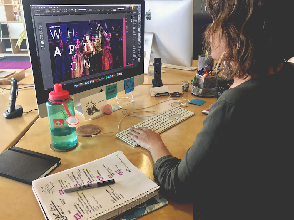
The Wharton Center for Performing Arts recently went through a brand refresh. Iterating a newly developed brand to its fullest is no walk in the park, but I was honored to be one of the first designers to take it for a spin. Their NextGen@Wharton program brochure has been a project of ours for the past three years, but this year we wanted to rethink it a little.
Instead of treating each panel as its own identity, I spent some time pondering different layouts, while still including the required content and imagery. Since the program was created to draw in young professionals who are unlikely to pick up a brochure and be enthralled, treating it like a poster seemed like a better solution. This allowed me to think more abstractly, which fit Wharton’s new brand.
It was exciting to work with a brand developed by a global marketing consultancy, but it still took significant design skill to get the job done — aka, it took a handful of rounds to get it right. Triple-checking the use of their color palette and typographical treatment was a common occurrence. Allowing for the time to experiment with a brand is not always there, but if you have the time, take it. Thankfully, with this project, I had a little time to familiarize myself with the brand assets.
As a designer at a small agency, the work pace is fast. Because of this, I get frustrated when designs don’t come together as quickly as I would like them to. I start to question my capabilities, which seems silly right? But that’s when I remind myself that good design (more often than not) doesn’t appear out of thin air, especially when working with an existing (and in this case, new) brand.
A change in perspective, collaboration, and patience is key. It’s like a puzzle. And that’s when I channel my inner Winston.