We work with quite a few advocacy groups who like to publish their statistics. More than 100 new clients reached, $2.6 million raised, 16 percent increase. You get the idea.
Here’s the thing. No one cares. OK, OK, that’s harsh. Intellectually, we all care that 16 percent more students are vaccinated (or whatever). But data is so … anonymous. And scale is so impossible.
Is 16 percent a lot? Is it a mere drop in the bucket? How many grains of sand are in the ocean? How many angels can dance on the head of a pin? Sixteen percent of a pizza is definitely not enough for a meal. But it would be an awesome raise if your boss surprised you with it. Data doesn’t mean much without context, and the psychology folks will tell you the human brain has a hard time conceptualizing vast numbers.
But you know what the human brain can conceptualize? A story. A journey. A narrative with twists and turns and emotion. Conflict and suspense and drama and, ultimately, resolution. Not only that, but people have more affinity for characters and stories that are familiar. (Which is why Marvel wins and none of us can wait for a bajillion hours of these guys.)
Wait, what was my point? Sorry, Robert Downey Jr. and Chadwick Boseman just got in the way.
Oh yeah, data.
Nope, an infographic about 16 percent of anything does not distract like those guys.
Back to the point. Often clients come to us with data which is very impressive in their technical world and exceptionally illustrative of the successes they have had. Our job? To help it be just as impressive to audiences. To illustrate why the data matters.
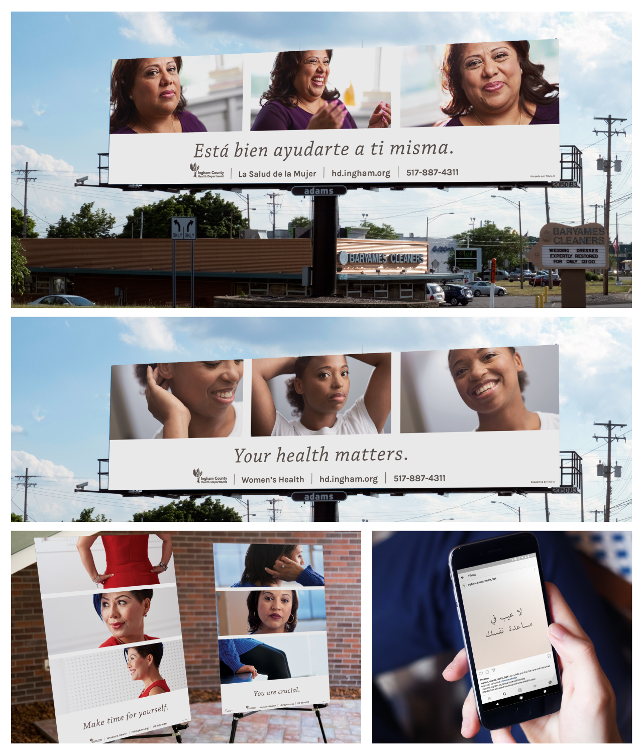
One of my favorite examples is the women’s health campaign we did a few seasons back for the Ingham County Health Department. We could have relied on data points to urge women to take care of their own health. Or, we could shine a light what self-care looks like.
Don’t you prefer those lovely faces to percentages?