
Finding the right typeface is like trying to find the right outfit to wear. You want to wear something cool and maybe a little funky, but not too funky, yet still you. Same goes for finding the right “fit” for your brand. You have to find the type that is … you. One that best represents where you’ve been, who you are today, and who you want to become.
Easier said than done, right? Especially if the brand you are developing is typographic. This was the case with branding the city of Charlotte, Michigan.
Charlotte wanted a brand that felt authentic. That nodded towards their rural and friendly upbringing, yet celebrated their revitalization. It was important to the city not to put up a facade, not have anything that was too flashy or edgy. The community is made up of genuine, kind, and optimistic people. Always has been, always will be. So the brand needed to reflect that.
While our gut told us that Charlotte needed to be a serif font, we experimented with a more “modern” look, ranging from thin Brandon Text to hefty Big John. Don’t get us wrong, they looked great. But didn’t evoke any of the warm vibes. Big John just didn’t seem authentic.
Then there are textured fonts. Inherently, there is nothing wrong about these guys. But again, authenticity was lacking. The prefabbed texture was never just right. Sorry, Swistblnk Monthoers. It was like it was trying too hard, which didn’t feel right for this agriculture community.
So just like Goldilocks, we found something just right. And that something was a serif font, with a few added features, and hand-rendered shading. We’ll let you figure out which font it is.
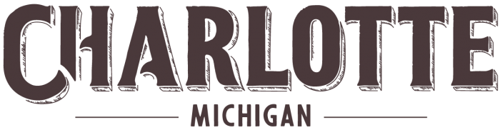
Timeless. Strong. Approachable. Authentic.
This bold serif had nice rounded parts to it to make it feel welcoming and sincere. And with the curved feet on the letters, this serif is sturdy, yet gentle. Plus, the hand-drawn shading brings this mark to life, evoking a sense of place and home.
All things that make up Charlotte’s character.
I would say we nailed it.