
It’s no secret I love making brands. Call me crazy, but there’s just something about creating a cohesive visual identity system that gets me out of bed in the morning. Well, that and a hot cup of coffee.
Laying the foundation for a new brand almost always starts with selecting the right type for a logo. Most of the time, it’s difficult to find a typeface that works perfectly for the set of characters being used, so customized type often comes in handy. It’s also a nice touch that adds uniqueness to the brand. Today, I’m highlighting a few of my recent favorites.
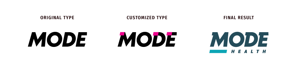
When developing the tone for this brand, we worked with the client to come up with words such as disruptive, driven and shifting. With words like those, you certainly can’t go wrong with bold italic type. However, that “M” as it stands lacked the edge I was seeking. Adding those subtle notches created a sense of speed and movement that felt just right with this type, and fit the personality of the brand. Success! On to our next example …

We work with a lot of clients who need to be visually clean-cut and conservative in order to be successful. Finding the right typeface for this particular client meant striking the perfect balance between elegance and boldness (kinda tricky, I know). I was drawn to this typeface for the charm of the subtle details, including the angled cut on the arms of the “E” and the low crossbar on that “A.” But the tight opening on the “C” was likely to cause problems in execution (i.e. embroidered at small sizes, it risked looking like an “O”), so, it needed a slight modification. Voilà! The “C” was opened up, and we were ready to rock. Moving on.
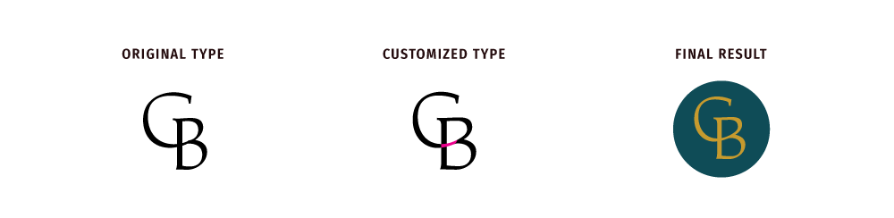
I rarely get to work with a set of characters that just works, but I struck gold with this monogram. The way the upper bowl of the “B” slanted gave me the perfect opportunity to connect it to the “C,” all I needed to do was make a few tweaks for the transition to be seamless. I also slightly decreased the width of the “C” and increased the width of the “B” so everything was lovely and perfectly balanced.
Like any good designer, I love attending to all the small details. Those are the things that make you stand out from the competition and make you unique.