
Co-Authored by Allison Raeck
Scaling down troves of highly technical data is no small feat. Especially in the healthcare industry, there is often much more data available than could ever possibly be sifted through or condensed. So how can we incorporate this information into an appealing design so that an audience of everyday people knows what’s going on?
Humans are visual thinkers. For most of us, it’s no surprise that the human mind processes visual information 60,000 times faster than text. So, if you need to get information to the masses as efficiently as possible, you’ll need to convert your text-heavy data into simple, comprehensible graphics.
Some best practices for designing for the masses
In design, it’s important to always consider the perspective of your viewer. Break down and re-organize information in a way that is clear and concise. Ask yourself: If someone only has a few moments to glance at my data, will they understand what I’m trying to communicate the first time, or will they have to re-read?
1. Establish a clear hierarchy, ensure elements are not competing with one another.
2. Avoid redundancy of information, and use a chart/graph that is efficient for the medium. Pie charts are often criticized for these reasons.
3. Use intensity, color, and proportionality to your advantage. These are visual cues we instinctively understand and can help effectively communicate ideas with fewer words.
…and scaling down your content for the masses, too.
You know your data and content better than anyone else. But this also means it’s more difficult for you to understand why others don’t. Truth is, most everyday people don’t understand the nitty-gritty vocabulary from inside your industry—you’ve got to scale it down.
1. Shorten your text as much as possible. Contrary to popular belief, saying more doesn’t make you sound smarter. Short content is shareable content. You can usually cut your content in half—and if you think you physically can’t make that block of text any shorter, think again.
2. Use a thesaurus to identify words at a lower reading level. If you are speaking to the general public, a third-grade reading level is a good rule of thumb. So if you are itching to say “innovative,” try “new” instead.
3. Ask someone from outside your industry to provide a second opinion. Often, the most qualified outside perspectives come from friends, older relatives, or even kids. (Beware: Kids can be brutally honest.)
An example: How not to present your data
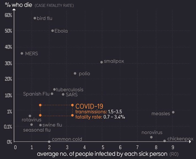
source: informationisbeautiful.net
This is a chart that has been floating around Instagram recently—it’s not the best representation of data. First off, the y-axis begins moving at 0.1% increments, then jumps to 1% increments. It’s hard to compare data when numbers get skewed like this. Also, a scatter plot may not have been the best choice for this information. The range of contagion could either read as “not a big deal” or “a pretty big deal” so it’s kind of hard to understand the main take away.
An example: Simple = effective
![]()
By now, we have all seen at least one version of this chart. The image above may not be aesthetically pleasing, but it’s the first version that includes the line “healthcare system capacity” added by Drew Harris. That simple addition brought much clarity and impact to the message. Since then we’ve seen it redesigned in several ways, most of which are far more polished, and still it retains its effectiveness in driving home its core message. It’s clear, concise, and straight to the point, delivering a message to people that is impactful and important. There is no repetition, no unnecessary information, and no chartjunk.
Now more than ever, be clear. Be transparent. Be concise. Write to your audience’s reading level, not your own. And balance your data and your text appropriately.