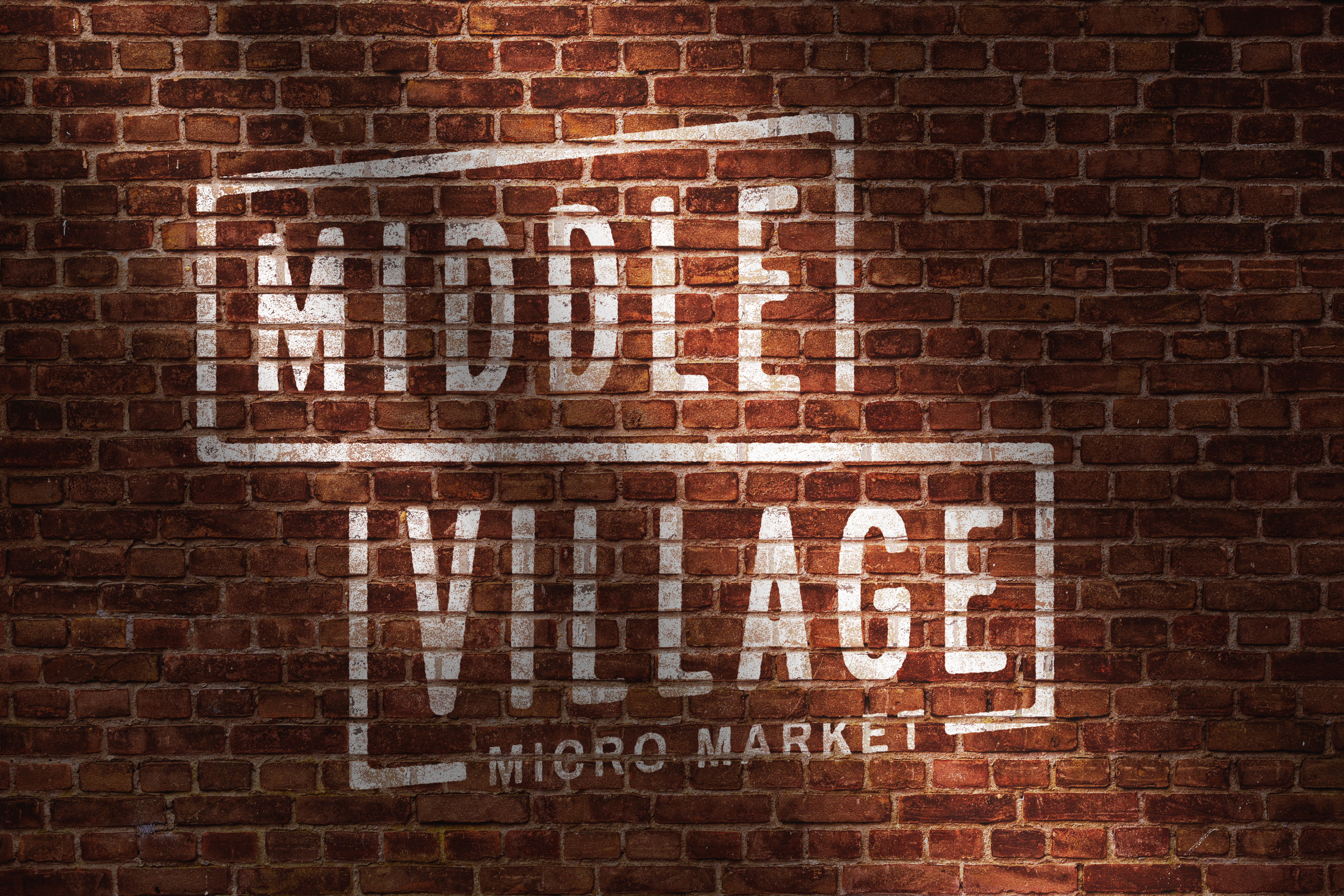
Recently, we had the pleasure of developing the name and logo for a new initiative in Downtown Lansing. Middle Village — a micro market for intermediate entrepreneurs in the middle of their business journey.
Unlike most projects that involve logo creation, this one was different. With Middle Village, there was no holistic brand-thinking — the focus was getting a logo and a name. Usually when I'm designing a mark, it's only but a small a piece in the larger brand equation. Your brand is much more than your logo, after all.
Though there was no big-picture to consider, this project still had the makings of every great logo design: intentionality and symbolism. The client wanted something that felt urban, so I aimed for a design that would look cool spray painted on a brick wall and natural next to graffiti art.

Ultimately, we landed on something bold, something that balances modern and timeless. Inspired by old signage, I added a modern twist with the oblique angles.
The skewed perspective of the type creates the illusion of an intersection, as if you're looking at a street sign in the middle of the city. The rounded, roughened treatment of the type ties the logo back to the grassroots ethos of Middle Village — a space for small businesses to thrive in the middle of their journeys.
This was a fast project with an expedited timeline, but a hard one for us to turn down, nonetheless. Clients like Middle Village support small business, strengthen local economy, and add value to their area.
Uplifting people and places — that's our kinda thing.
