
All things to all people is something we cannot and should not be — especially as message-makers. Accepting this truth allows us to focus solely on our audiences so we can give them stronger messaging with utter clarity. In a recent project, we created a website and visual identity aimed at a very narrow audience. Naturally, the specificity of their needs dictated our approach.
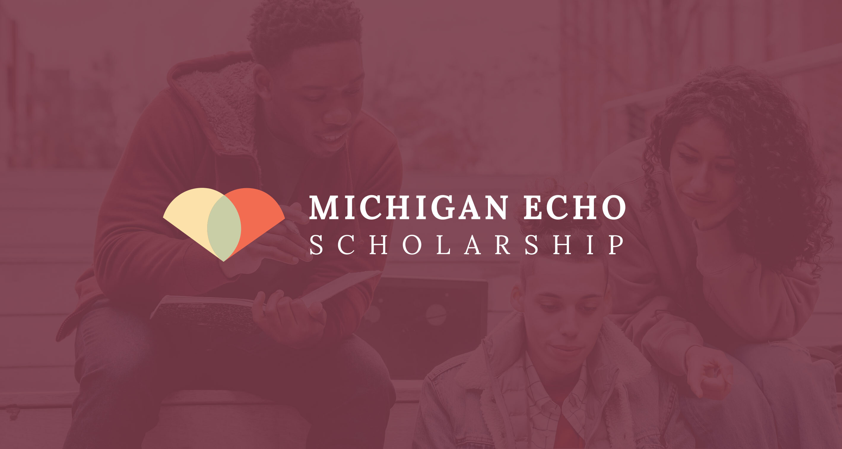
The project was for Michigan ECHO Scholarship, a scholarship program led and managed by the Michigan College Access Network (who we rebranded last year). The program offers tuition-free education to people in a very tight niche: those who worked essential jobs, cannot access federal financial aid, and have not previously earned an associate's degree, among other specific eligibility requirements. The intended recipients of this scholarship are comprised mostly of immigrants, refugees, and asylum seekers. English is their second language, so appropriate tone and messaging were critical in reaching them.
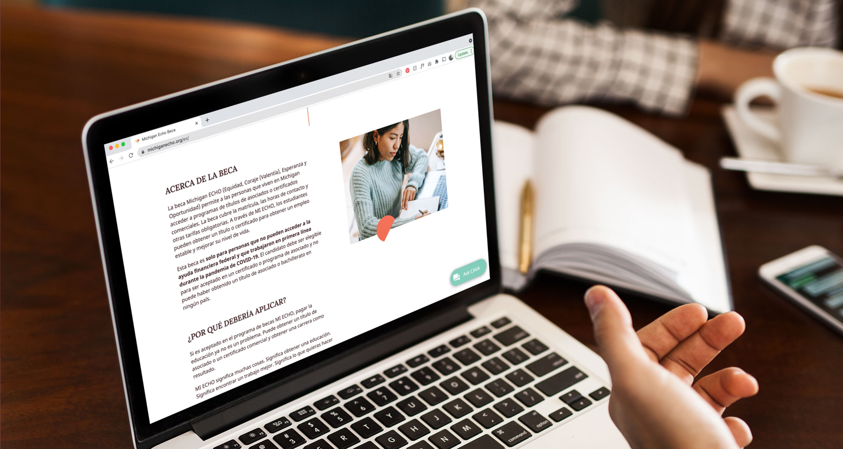
In order to keep the copy succinct and readable, the writing process began like a high school English class. (The tried and true WWWWWH.) Breaking the Michigan ECHO Scholarship into its most fundamental parts — Who, What, When, Where, Why, How — ensured that every necessary piece of information was communicated at an understandable reading level and, thus, was easily translatable for a multilingual platform. Plus, it made formatting copy for the web a breeze.
As mostly non-citizens, this audience harbors justifiable distrust with government-related programs and authoritative organizations. Though Michigan ECHO is funded privately, it requires applicants to fill out some of their information. Therefore, we needed to establish trust so the audience felt safe and compelled to apply.
Explicitly stating things like "we DO NOT ask for your home address" works toward this end, but building a sense of security goes beyond face value words. We wanted to tell the Why behind ECHO, why it exists and what it can do for an applicant's future: "The MI ECHO Scholarship isn't just financial assistance, it's the next step in building a better life for you and your family."
This sense of hope, conveyed through messaging and tone, was complemented by conscious design choices. Warm, soft colors created an encouraging feel and sense of comfort — inspiring users to take action and apply. The shapes of the mark hint at a heart, and the green inside symbolizes growth, which is exactly what the audience is after. Lora, a serif font, has a slightly more modern look than classic serifs like Garamond and Times New Roman, adding a pop to the copy while retaining the timeless, poised feeling of a scholarship program.
We were thrilled to work on a project that aligns so absolutely with our values. Empowering folks to get an education is always a win, and we believe Michigan ECHO Scholarship is a righteous pursuit that will do people a lot of good.
Have a worthy cause of your own? Don't worry, we've got a lotta bandwidth. We'd be happy to help.