
If you’re from Lansing or the surrounding area, you’ve probably heard the iconic and infamous story of the “sad little town.” If not, we’re happy to recap it for you.
Late last year, the editorial page editor of the Detroit Free Press, Nancy Kaffer, published an article suggesting Detroit should replace Lansing as Michigan’s capital. She discussed various points supporting her reasoning, including but not limited to population, parking (simultaneously too much of it and not enough of it), and the availability of tacos. The kicker of the article was one notorious line: "When you tell Lansing residents they live in a sad little town, they don't get offended. They just shrug sadly and look sorry, because they know it’s true."
In Lansing, that went over just about as well as you would imagine. There were tweets, news segments, response videos, and a Freep op-ed from the mayor. Proud Lansing residents latched onto that “sad little town” phrase. And Jen scurried to secure the domain name sadlittletown.com and social handles in a late-night fury.
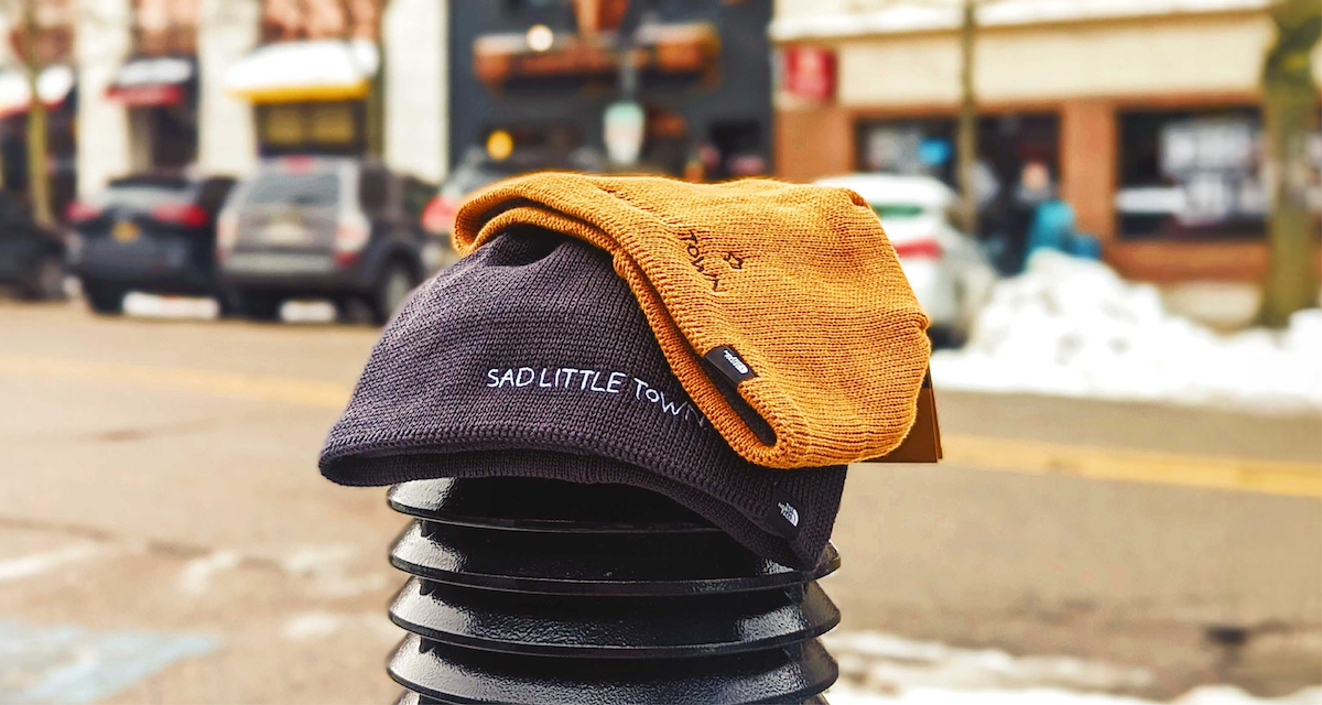
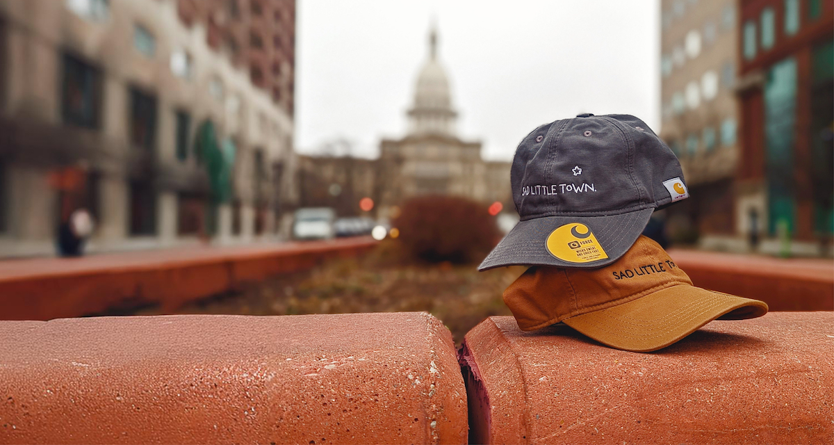
From there came Sad Little Town: A lifestyle brand with merch for proud Lansing fans to embrace their inner sad. The brand offers shirts and hats with different designs and styles, and a portion of proceeds benefit local organizations dedicated to uplifting our Lansing (Downtown Lansing Inc., REO Town Commercial Association, Old Town Commercial Association, and South West Action Group).
When building the Sad Little Town brand, we strove for sassy, tongue-in-cheek, and pointed — a few of our favorite things. Here are a few of the top points we kept in mind when designing the brand:
Authenticity is everything.
Sad Little Town is a rallying cry uniting those who love Lansing, and it hinges on authenticity. It’s about owning who you are and where you live, and embracing your inner Midwest emo. This aesthetic inspired the design direction for the brand; we explored visual themes derived from the 90s and early 2000s, with gritty typography and grassroots elements.
Consider the medium.
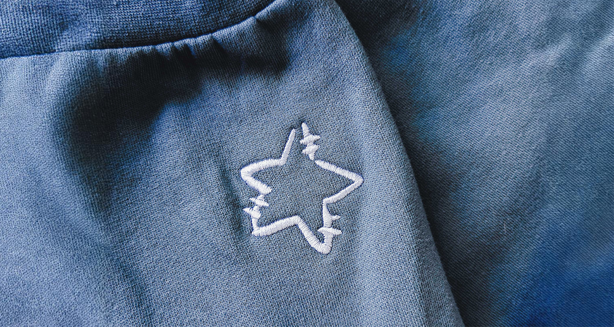
Knowing this would be a retail brand, we carefully considered the types of merchandise that would feature the logo, such as hats and t-shirts. This meant taking into account the space available on these apparel items to ensure the logo’s shape and size would be suited for each piece of merchandise, ultimately leading us to two pieces: the wordmark “Sad Little Town,” and the stitched star icon alluding to the capital city on a map. These can be used together or on their own, giving the logo great versatility for applying to merch: beanies, water bottles, hoodies, whatever you like. We also factored in color options from brands we wanted to use (such as Carhartt and The North Face) when building the color palette. These eventually became the brand’s signature colors, which can be recognized from afar at a festival booth.
Seize the moment.
Sometimes you have to work fast. Knowing how quickly the internet moves on, we knew getting this brand up and running as swiftly as possible would be a top priority. The timeliness was half of the intrigue, so we worked on-the-fly to get the website and brand live within a couple of weeks after the article. Simple and fast often go hand-in-hand, and in this case it was a beautiful partnership.
In the end, the Sad Little Town snowballed into a broader lifestyle brand that outlived the moment — not just for Lanstronauts, but for people across Michigan. And, hey, Crains wrote about it! You could use a new shirt.