
Replacing a charming and vintage logo that has more than 40 years of well-loved use is not a job to be taken lightly. And while the initial focus was on the mark itself, the project also necessitated developing a fresh visual system to support current and future efforts in multiple mediums. Luckily, the organization's intrinsic brand was solid and strong, so this logo refresh was a great opportunity to modernize as well as pay homage to MSUFCU's roots and strong culture.
Thus our task was to build a new mark to represent the organization's established brand well, could endure for a decade or more, and has the versatility and systems thinking that allows its elements to support everything from a social media avatar to physical environment design to mortgage paperwork to credit card design. I'll break down the elements here.
First, let's address typography.
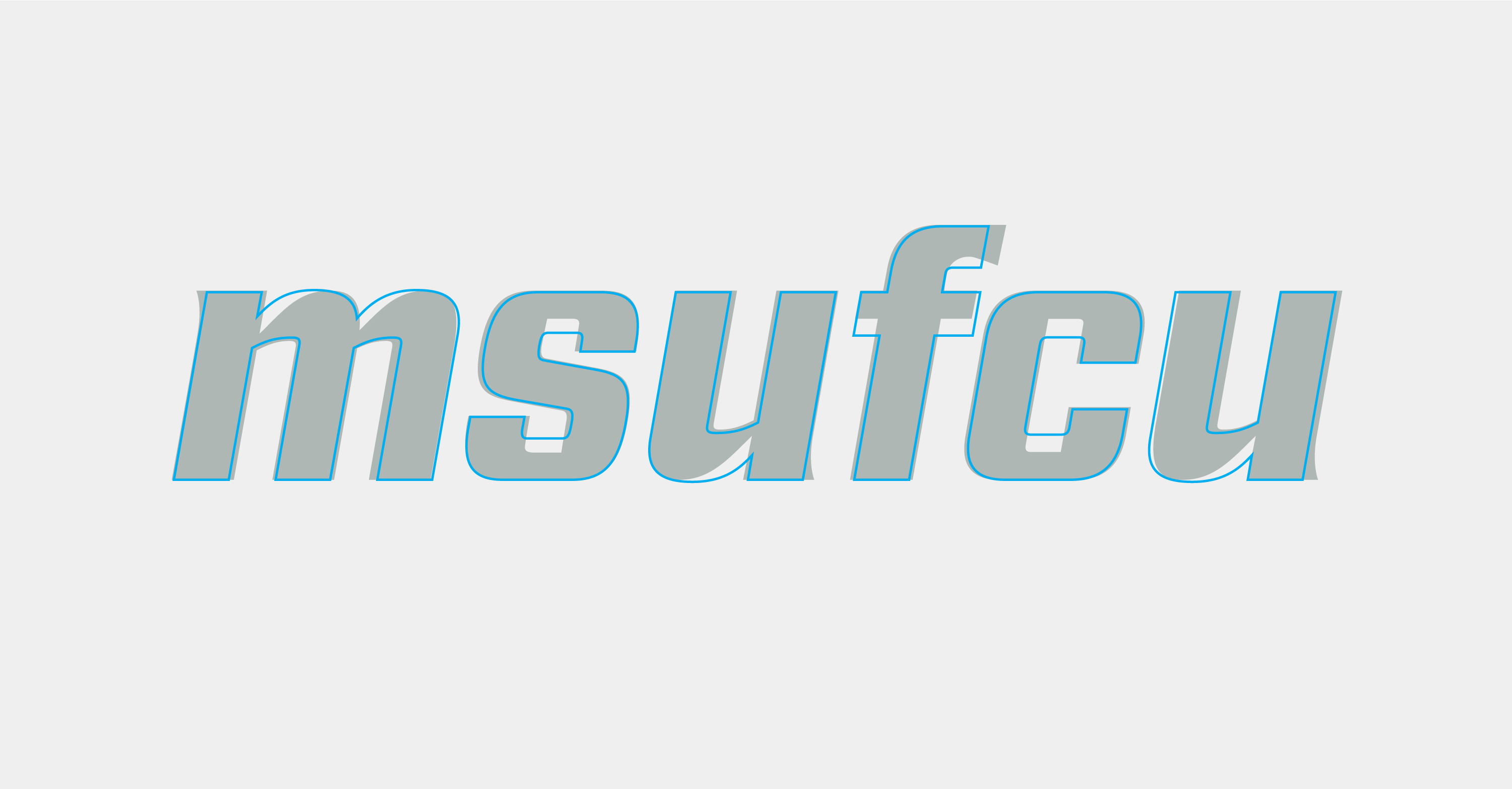
MSUFCU is...a lot of letters. Unlike acronyms like BOGO or HIPPA (or the recently born ECHO), each letter has to be individually pronounced and read. It is also not easily recognizable to someone far outside of the area or outside of the state. The goal was to make a mark that was easily digestible to someone driving down the street who may have not yet interacted with MSUFCU. Lowercase typography was the chosen path for accessibility purposes, since lowercase text is more legible than upper case text. Not only is it more legible, but it also conveys a friendliness and welcoming nature as opposed to upper case text. All of these factors were in line with the goals and tone we set out for.
So we figured out how to set the typography, but what about the font itself? That was a whole new question. I wanted to pull inspiration from the charming parts of the previous logo, while leaving behind the clunky, unaccessible elements. I landed on a customized version of the typeface Industry. It was a good base to start from since it had the blockiness of the original MSUFCU mark. I went with a bold, italicized weight — characteristics present in the previous logo. I modified the stroke widths to add more contrast and hint at the stencil feel from before. I also added on some half-serifs to bring back some personality and funk. The end result was one that felt suitable and balanced between needing to be formal and grown-up and needing to be more playful and friendly. This was important for a brand who meets its members at all stages of their life cycle, from childhood through retirement.
Iconography
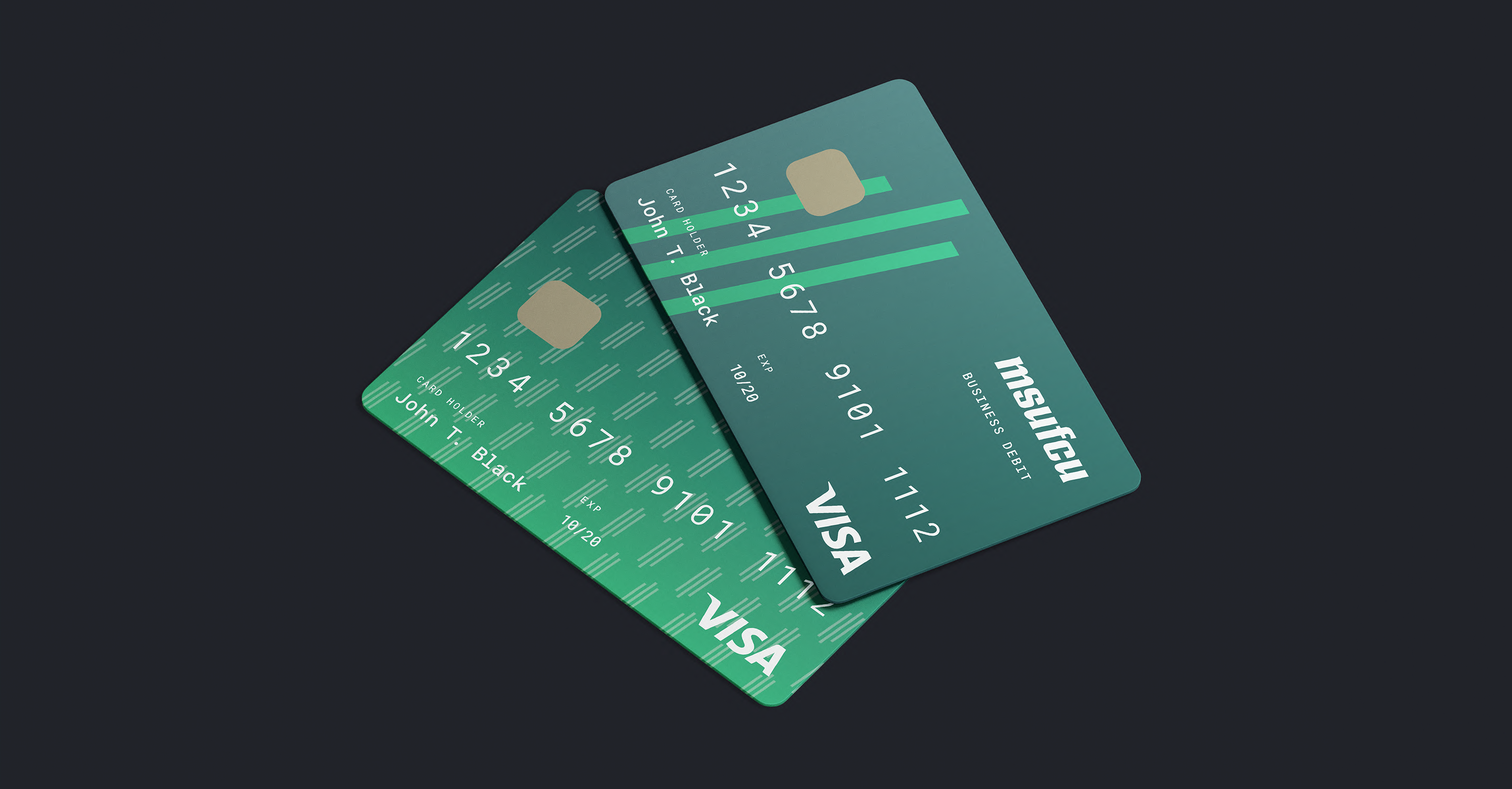
We knew the client was going to want an icon that could also be used as a representation of the MSUFCU. Since the typography had a lot of visual flair, it needed to be paired with something subtle and sleek. Thus, the three lines were born. The simplicity shouldn't be underestimated, because it makes for a mark that is quite flexible and lends itself to a lot of symbolism. The three lines hint at the "M" in their form, and they also represent MSUFCU's commitment to its members, employees, and community. More broadly, these three lines also symbolize the three top priorities of MSUFCU — empowering its members to achieve financial security, helping make their goals a reality, and inspiring them to dream big.
Color
Color-wise, we knew we would stick to the tried-and-true green (Michigan State University is in the name, after all), but there was room for a little refresh in the accent color. Our client still wanted to stay within the green family so as to not drift too far from its roots, so we opted for a bright, fresh green color to accent the dark MSU green. Adding in the accent color helped give the mark more dimension when shown in full color, which was something the previous mark lacked. The system also accounts for the differing color requirements in print and digital media — a consideration that we take for granted but did not exist when the previous logo was born.
System Thinking
We took a systematic approach to this logo, building it from pieces that could be added or taken away for specific situations as needed: the icon, the wordmark, the descriptor, and the tagline. Since these elements were to be used almost interchangeably, I needed to consider how to they could work as a flexible system.
![]()
The icon and wordmark are common components of a logo, but harmonizing a descriptor and tagline took a little more thought. These two lines of text needed to feel related, yet distinguished from one another. This was achieved by pulling the boldness of the wordmark for the descriptor, and the italicized nature of the wordmark for the tagline. When the whole package is used together, a thin rule line separates the descriptor and tagline to help break up the text.
Creating an icon that could be used with flexibility also took some system-thinking. Our client had a specific request for us to create a pattern from the icon, and I wanted to create something that would make for an interesting graphic when used oversized as well. Once again, keeping things simple was the best approach for something that could be used at large and small sizes.
In all, this project reaffirmed that rewarding, high-quality products require time, careful strategy, and planning. If you're interested in learning more about the process and execution of the updated MSUFCU brand, head on over to our Case Studies.